Thursday, November 13, 2014

Teaching Digital Figure Painting Class at AAU, SF.

Recently I've had the pleasure of teaching a newer class at The Academy of Art University, SF called Digital Figure Painting.  The whole class draws and paints on some gorgeous new touchscreen Cintiqs from a live model in the center of the room complete with professional lighting.  Each class I am tasked with working with a nude model, setting up the class lights (in an creatively effective way which demonstrates the topic of the week), critique student work (in progress as well as homework), lecturing on the weekly topic, and demoing the various concepts on my computer for them which is relayed to a big screen they all see.   Below are a few of my class demos- mostly focusing on light and color:


Teaching new class- exampes of 2 hour demos.

Recently I've had the pleasure of teaching a newer class at The Academy of Art University, SF.  During each class period  I digitally paint a different material / texture on a cube in Photoshop from scratch while I talk about the material of the week, the painting process, how to analyze, simplify and make the most out of your reference while simultaneously strengthening critique language and constructive criticism abilities among the students.  Each demo is finished in about 2 hours.  Below are some examples:


Thursday, November 8, 2012

Bug forms.

Recently I started exploring http://www.ctrlpaint.com/.  I watched this video which talks about drawing though forms (thinking of objects with volume) instead of considering just the flat silhouette shape.  I tried the suggested exercise of finding bug reference images and drawing over the file while attempting to think about and display the flow of the forms in perspective.  All of the photos displayed were found on the web, and are not my own.  The drawings are all me, however and done digitally on a Cintiq. 


Tuesday, October 9, 2012

Photoshop brush test.

Lately, I have been refining my knowledge of custom brushes in Photoshop.  I followed a tutorial by Brian Recktenwald, from the book "Digital Painting Techniques", to set up a single custom made brush which has the ability to make multiple types of marks.  The exercise has you create a brush from an ink splatter (with some Photoshop tweaks) and convert it for use as a smudge tool.  What was most interesting for me however, was the idea of getting the most variety out of one brush as possible.  This is accomplished by modifying the brush settings (shape dynamics, scattering, texture etc.).  Combine that technique with a Wacom tablet or Cintiq with pressure sensitivity and you can simulate traditional 2D media very effectively.

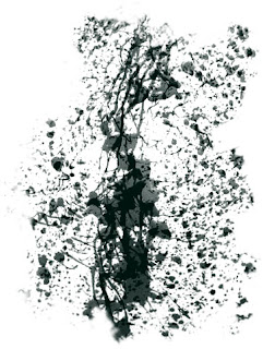
I created a brush that would be useful for creating a rough surface and then modified it using some of the techniques I learned in the Digital Painting Tutorial.  Here is what my "raw" brush looks like:


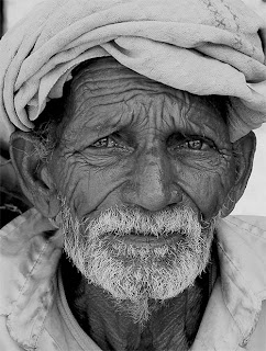
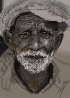
I then found some photo reference of a rough faced old man to test my brush.  The image was found here and was taken by the photographer Anil Purohit.  I did not trace the image, or sample colors, values etc. from the piece, but instead used the traditional method of sighting my reference and directly painting in the way I would approach an acrylic painting.  I was not attempting to perfectly duplicate the photo, but rather use it as a reference point to work from.  You may notice that in my version, the head is more straight on, and the expression is more melancholy.


The first stage is to block in my shapes and values using broad stokes with a large version of my custom brush.


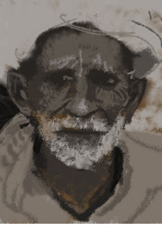
The second stage is where I refine my shapes using a smaller brush with less scattering dynamics.


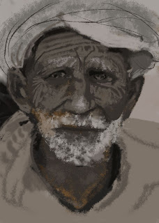
The final stage is where I add the darkest darks, and lightest lights to the piece while adding a focal point (the eyes).  This is done with the smallest version of my custom brush.


Wednesday, October 3, 2012

Yellow lemon, lighter and gluestick.

Here is a traditional acrylic piece I did a little while ago.  I went for a complimentary color scheme with this one, using a deep violet instead of black (which tends to deaden paintings) to contrast the yellow objects.  


Wednesday, September 12, 2012

Robert Caisley's FRONT - Samuel French


Earlier this year, I was asked by the fine people of Samuel French for the right to license a traditional collage (I made more than a decade ago) for use on the cover of their actors edition of the Robert Caisley play "FRONT".  I originally created the piece while still in art school, in Philly, as part of a collaborative project where the theater, illustration and graphic design departments worked together to create a poster for the production of FRONT.  The title was recently picked up by the legendary play publishers Samuel French (doing business since 1830) and Robert was kind enough to bring my illustration to S.F.'s attention, who then licensed the art from me. 

Thanks to Robert Caisley and the fine people over at Samuel French for the opportunity!